
The U.S. Department of Education released its annual report on the federal Pell Grant program this week, which is a treasure trove of information about the program’s finances and who is receiving grants. The most recent report includes data from the 2012-13 academic year, and I summarize the data and trends over the last two decades in this post.
Pell Grant expenditures decreased from $33.6 billion in 2011-12 to $32.1 billion in 2012-13, following another $2.1 billion decline in the previous year. After adjusting for inflation, Pell spending has increased 258% since the 1993-94 academic year.

Part of the increase in spending is due to increases over the maximum Pell Grant over the last 20 years. Even though the maximum Pell Grant covers a smaller percentage of the cost of college now than 20 years ago, the inflation-adjusted value rose from $3,640 in 1993-94 to $5,550 in 2012-13.

The number of Pell recipients has also increased sharply in the last 20 years, going from 3.8 million in 1993-94 to just under 9 million in 2012-13. However, note the decline in the number of independent students in 2012-13, going from 5.59 million to 5.17 million.

Recent changes to the federal calculation formula has impacted the number of students receiving an automatic zero EFC (and the maximum Pell Grant), which is given to dependent students or independent students with dependents of their own who meet income and federal program participation criteria. Between 2011-12 and 2012-13, the maximum income to qualify for an automatic zero EFC dropped from $31,000 to $23,000 due to Congressional action, resulting in a 25% decline in automatic zero EFCs. Most of these students still qualified for the maximum Pell Grant, but had to fill out more questions on the FAFSA to qualify.

The number of students receiving a zero EFC (automatic or calculated) dropped by about 7% from 2011-12, or about 400,000 students, after more than doubling in the last six years. Part of this drop is likely due to students choosing a slowly recovering labor market over attending college.

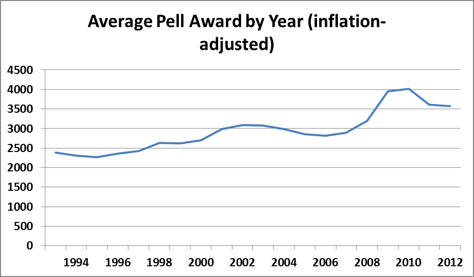
UPDATE: Eric Best, co-author of “The Student Loan Mess,” asked me to put together a chart of the average Pell award by year after adjusting for inflation. Below is the chart, showing a drop of nearly $500 in the average inflation-adjusted Pell Grant in the last two years after a long increase.
I hope these charts are useful to show trends in Pell receipt and spending over time, and please let me know in the comments section if you would like to see any additional analyses.
[Cross-posted at Kelchen on Education]


