
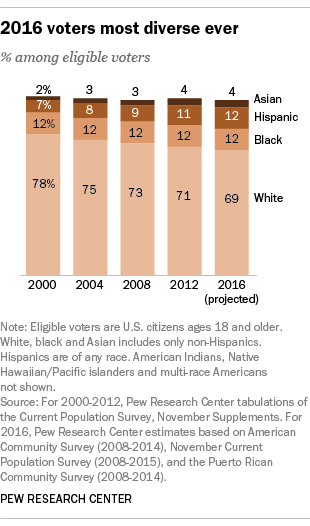
Back in March, Pew Research said that “the U.S. electorate this year will be the country’s most racially and ethnically diverse ever,” and created the following chart to estimate the demographic makeup of the 2016 presidential electorate.
Now, that chart estimates the “eligible voters,” which is different from the “actual voters,” but compare the Pew chart to the following screenshot from the internals of the latest ABC News/Washington Post tracking poll. This shows the “voter preference by demographics of likely voters,” and the overall ratings are Clinton 47% (second column), Trump 45% (third column), Johnson 3% (fourth column), and Stein 2% (fifth column).

Hopefully, it’s not too hard for you to see that that the current ABC News/Washington Post Tracking Poll has a demographic makeup that most closely resembles the eligible vote for the 2004 election. Both have a 3:1 white/non-white ratio and both have the white percentage of the vote pegged at seventy-five percent. The main difference seems to be in the percentage of Asians, which the tracking poll acknowledges will be greater this year.
To see the difference between eligible and actual voters, let’s look at one more chart from Prof. Michael McDonald’s Elections Project:
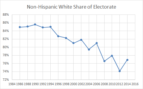
Here we can see that the actual white percentage of the vote dropped from about 80% in 2004 to 77% in 2008 to 74% in 2012. The logical inference is that it will drop to about 71% in 2016, assuming that the rate of demographic diversification hasn’t declined or accelerated and that other factors remain steady.
Another way of looking at this is to see how much the actual white vote exceeded the eligible white vote as a percentage in the last three elections. In 2004, the white eligible vote was only 75% but its actual vote was about 80%, or plus 5. In 2008, the numbers were 73% and 77%, or plus 4. In 2012, the numbers were 71% and 74%, or plus 3. This year that eligible vote is about 69%, and we don’t know what the actual will be. I just doubt that it will suddenly be plus 6.
This is just one example of how polls can differ because of different assumptions. We don’t know how different demographic groups will turn out relative to each other and in comparison to previous elections, so everyone has to make some informed guesses. Pollsters ask questions to try to gauge differential voter enthusiasm. It could be that Trump’s voters are more motivated to vote than Hillary’s, and that could help him somewhat compensate for other trend lines. But, looking at those charts do you really think it’s likely that the white percentage of the vote will fail to decline? Based on the pattern since 2000, we should expect a two to three percentage decline in the white vote.
I honestly detest the whole genre of “skewed polls” analysis where people go into denial about polls they don’t like and find reasons to explain them away. But I’m not positing anything outlandish here. I’m not telling you that blacks will stay home or that Latinos will vote in unprecedented numbers. I’m just looking at a trend line. And the trend line tells me that it’s an unreasonable supposition that the electorate will be 75% white.
Polling is one part collection and one part analysis. The most important variable is your turnout model. If your turnout model doesn’t make any sense, then it’s hard to see how your poll could be correct unless it’s just a happy accident.
But we can stipulate if we want that the ABC News/Washington Post Tracking Poll at least got the collection part of this right, which means that Trump is trailing Clinton by two points if we’re living in 2012.


